The Thrill Factory
A complete adventure-booking platform for Rishikesh — browse activities, pick a slot, book and pay, and manage it all. An end-to-end product designed across desktop and mobile.
- Project
- The Thrill Factory
- Adventure booking platform
- Scope
- End-to-end product
- 16 desktop · 17 mobile screens
- Platforms
- Desktop & mobile
- Role
- Product & UI/UX design
Booking an adventure should feel as exciting as the activity. Most activity sites bury the thrill under generic listings and clunky checkouts. The brief was a complete platform — discover, compare, book, pay and manage — that sells the experience emotionally while still handling the un-glamorous parts (slots, carts, OTP login, payment, booking history) cleanly, on any device.
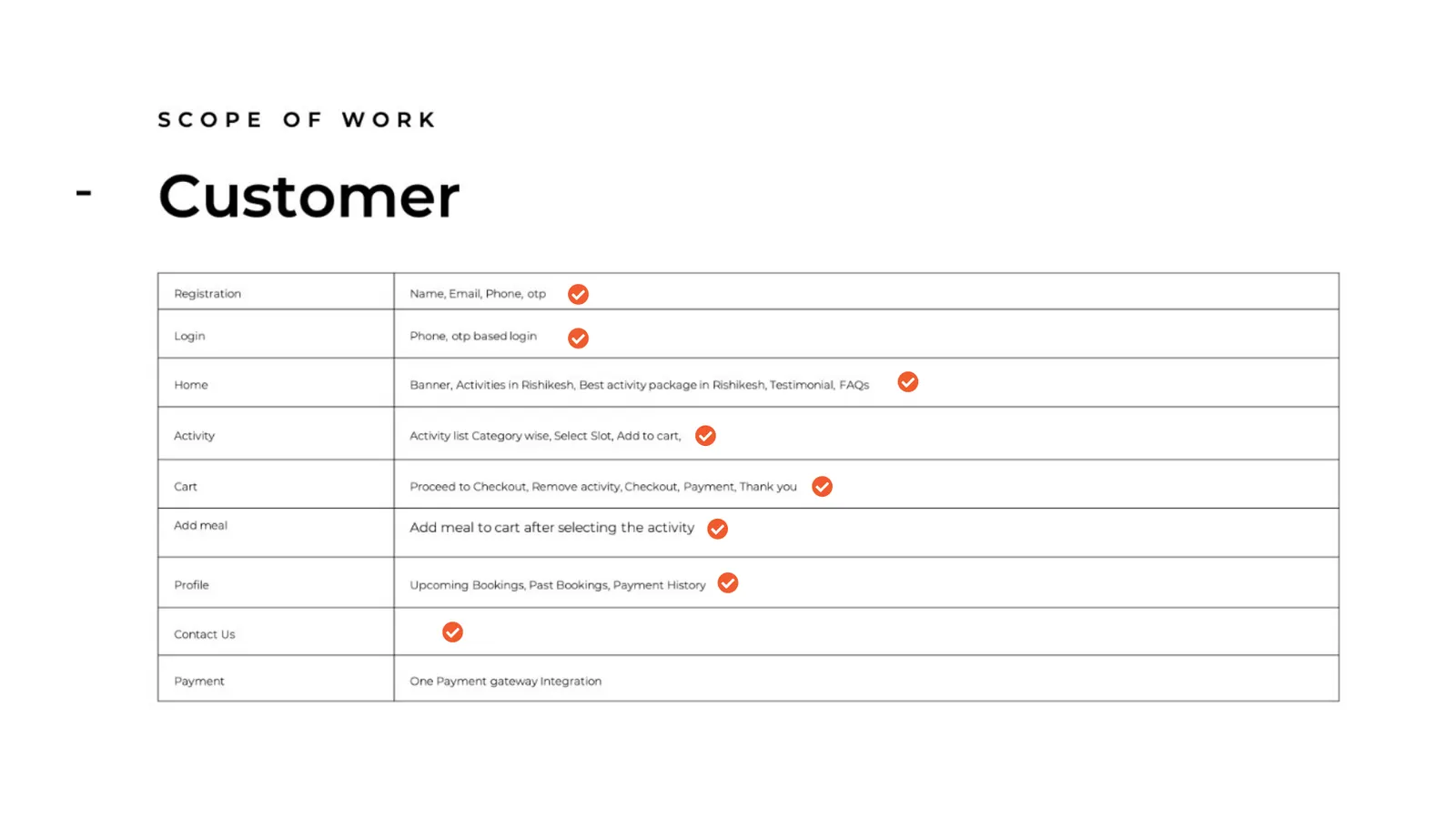
A full consumer product scoped around the customer journey — registration, browse, cart, booking, payment and profile — for an adventure-tourism brand operating in Rishikesh. The design had to carry both the marketing storefront and the transactional product in one consistent system.
Constraints
- Sell the experience first — a cinematic, image-led storefront — without sacrificing a clean transactional flow.
- Cover the entire journey: discover → details & slots → cart → book → pay → confirm → manage.
- Design for both a wide desktop canvas and a one-thumb mobile experience, from a single system.
- Handle the practical bits properly — OTP login, empty states, payment history — not just the happy path.
An adventure, from first glance to booked
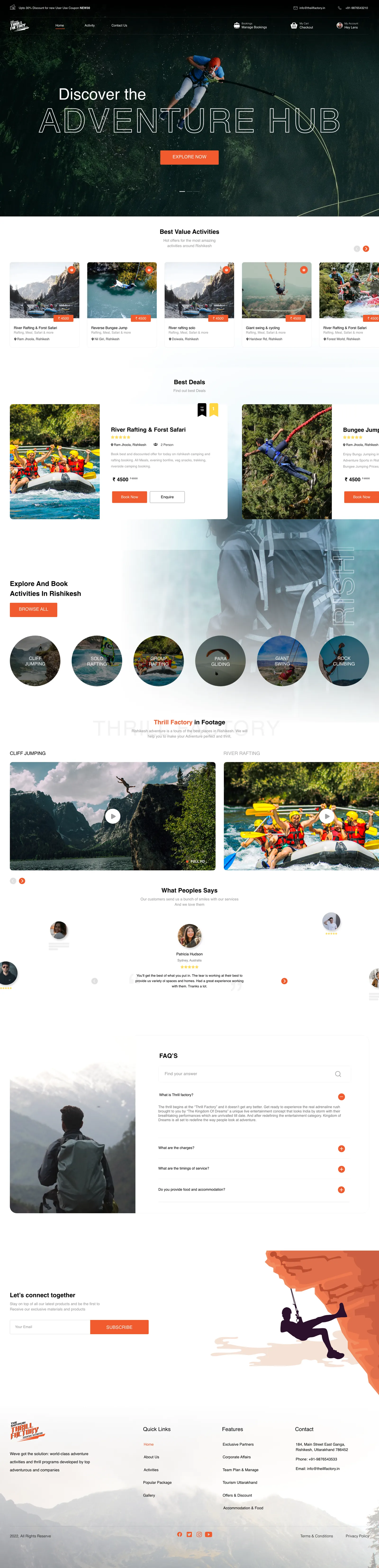
The Thrill Factory sells adventure — rafting, bungee, paragliding, cliff jumping — around Rishikesh. The design had to do two jobs at once: pull people in with a cinematic, image-led storefront, and then carry them cleanly through a real transaction — slots, cart, payment, confirmation.
I designed the whole thing as one system: a marketing homepage, a browsable catalog, detailed activity pages, and the full booking-and-account flow — on desktop and mobile.
The booking journey
- 01
Discover
A cinematic homepage surfaces best-value activities, deals and categories — built to make someone want to go.
- 02
Explore the activity
Each activity page carries a gallery, inclusions, real pricing and selectable time slots.
- 03
Cart & customise
Add activities to the cart, add a meal, and review everything before paying.
- 04
Book & pay
Enter traveller details, pick a slot, and check out through a single payment step.
- 05
Confirm & manage
A clear confirmation, then a profile with upcoming and past bookings and payment history.
Every page — desktop
The full desktop product, as real scrolling pages. Hover to preview a page, click to read the whole thing top to bottom.
The whole thing, in your hand
The mobile experience isn't a cut-down version — it's the same product reshaped for one thumb: the cinematic hero, the catalog, activity details and slots, the cart-to-payment flow, OTP login, bookings and profile.
Same brand, same journey, redrawn for the phone.
Every page — mobile
The complete mobile product in realistic phone mockups — hover to preview, click to scroll the full page.
In closing
What changed
- A complete adventure-booking product designed end to end — storefront, catalog, activity pages, and the full booking-and-account flow.
- A single, consistent design system carried across 16 desktop pages and 17 mobile screens.
- The whole journey covered — discover, details & slots, cart, booking, payment, confirmation, and management — including OTP login and empty states.
What's still open
- An earlier project in my portfolio — the design is complete; production build-out sat with the client/dev side.
- Today I'd add more explicit loading, error and recovery states, and tighten the accessibility of the booking forms.
What I learned
Selling an experience and running a transaction are two different design jobs, and a good product has to do both without feeling like two different products. Keeping the cinematic storefront and the practical booking flow inside one consistent system — across desktop and mobile — is where the real craft was.
Wagr